Bootstrap grids are useful tools for displaying information correctly. Grids arrange information into columns with adjustable widths, but do not provide a clear structure like a table.
How to Create a Bootstrap Grid
- Create a page or edit an existing one.
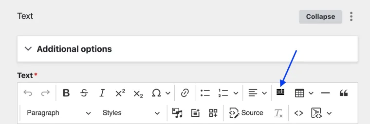
Add any content that has the Editor Toolbar (Text, Accordion, Cards, Text with Background, Text on Media) and select Insert Bootstrap Grid.
Image
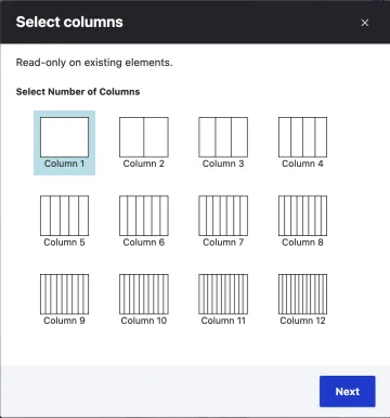
Select the desired number of columns > Next
Image
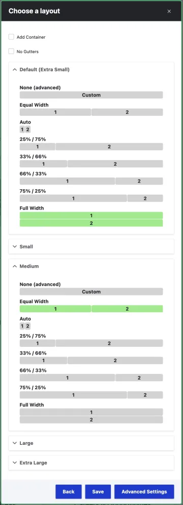
- Select the desired width of each column (example at right) by expanding accordion for each each display size
- Use the following list to set your column behavior based on width setting
Extra Small - Mobile phone vertical display
Small - Mobile phone horizontal display
Medium - Tablet display
Large - Laptop display
Extra Large - Desktop display
- Selecting None will cause the column width to adapt to the length of text. If the text inside a column exceeds one line in length, the column will be pushed to the next line.
- Set desired column behavior for each width setting. The largest column behavior width setting specified will apply to all larger width settings. See Tip below for more info.
- Use the following list to set your column behavior based on width setting
- Save
Tip: If you wish to add two columns - like the text (left) and image (right) shown below, follow these steps:
- Insert a bootstrap grid using the steps above
- Select 2 columns
- Open the accordion for Default (Extra Small) device, and select the equal width columns shown in green in the image (right or below)
- Open the accordion for the Small device, and select
- Select the number of columns for the grid
- use the extra small category for mobile settings, and small for desktop settings
Note:
Full width (100%) is usually the best option for mobile settings.

By right-clicking on your grid, you can resize column width, but you will not be able to change the number of columns. There are two methods of editing a grid.
- Method 1: Right click on your grid and select Edit Grid.
- Method 2: Click inside your grid and click on Insert Bootstrap Grid in the Editor Toolbar.
- Aligning text, media, or block items
- Organizing paragraphs or lists into columns
- Once the grid is created, the number of columns cannot be changed
This sample grid has 4 columns of equal size and demonstrates how different elements are resized to fit the Bootstrap Grid.
Column 1 content
This is a column with text and a page view.
Column 2 content
This is column with text and a photo.

Sample Image Credit B
Column 3 content
This is a column with just text.
Text in columns is constrained to fit the column width and will adjust if the column width is changed
Column 4 content
This is a column with text and a table.
| Student | Contact |
|---|---|
| Wilma Wildcat | wilmawildcat@email.arizona.edu |
| Wilbur Wildcat | wilburwildcat@email.arizona.edu |

