
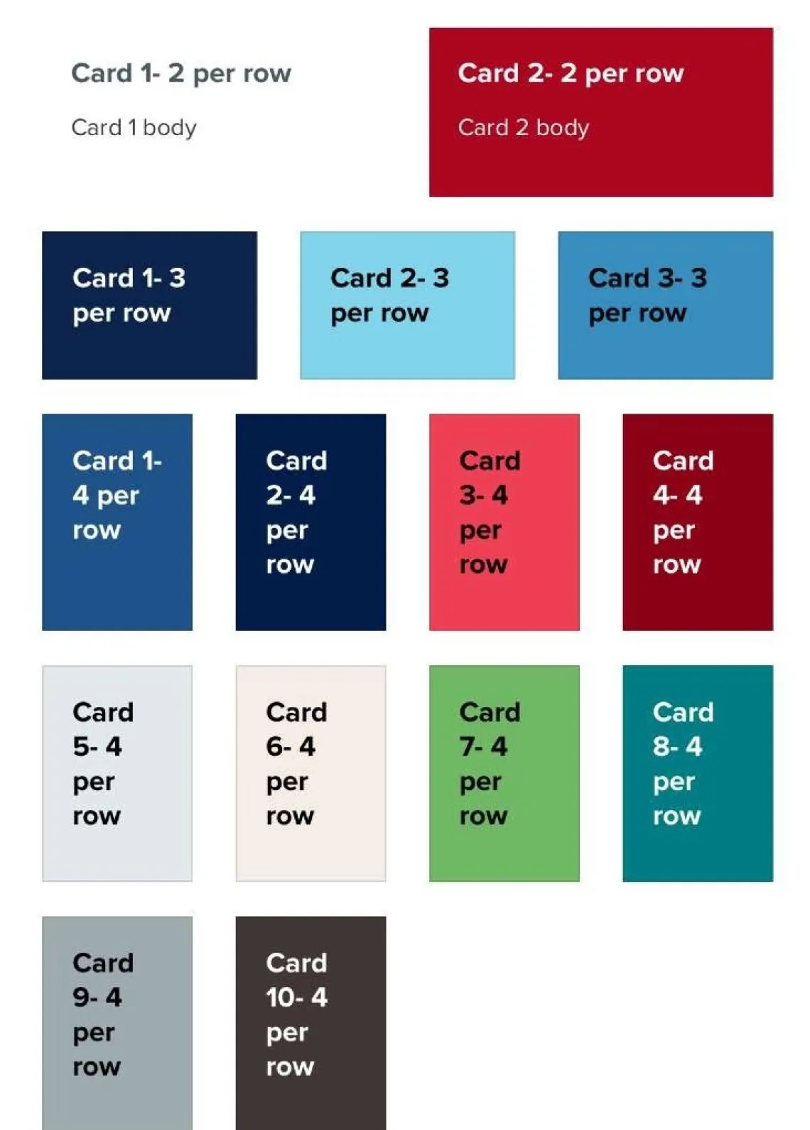
Cards are used to organize content on a page. You will be limited to 4 cards per row.
There are two options for cards: bordered or borderless. Bordered cards place a thin grey border around the card perimeter, while borderless cards do not.
How to Create Cards
- Create a page or edit an existing one.
- Click Add Cards.
- Select number of cards per row (3 is standard, but up to 4 cards are allowed).
- Under Card Style, choose between Bordered or Borderless.
- Choose a Card Title Style, either Title Within Card (default), or Title on Image.
- Choose a heading level for your card titles using the Card Title Level dropdown (the heading level of your card title).
- Select a Card Title Display Size (visual title display size).
- Check or uncheck the Clickable Cards box, which will make the entire card clickable rather than just the link.
- Under Additional Options:
- Select the desired amount of space at the bottom of the card row before the next element displays under Additional Options > Bottom Spacing.
- You can also edit the display on tablets and phones. More detail is provided in Alternative Displays below.
- Add a title. Adding text in the Card Group Title field will create a title that appears above your group of cards. This is optional.
- If you've added a Card Group Title, select its color using the Card Group Title Color dropdown.
- Select Card Background, Add Media, enter a Card Title, select Card Title Alignment, enter a Card Body, and add a link with the fields Card Link Title and Card Link URL, then select Card Link Style.
- Click Add another item to add more cards.
- Save.
Card image ratio recommendations
- Rendered aspect ratio: 4:3
- Maximum rendered size: 1110 × 832.5 px
- All images get cropped to 4:3 aspect ratio (customizable area in Drupal UI)
- Can upload larger images that will automatically get scaled down/cropped
Useful Links
Sample Bordered Cards
Below is a row of bordered cards that demonstrates the display of a card with an image and text, a card with an image and a link, and a card with text and a link.

Lorem ipsum dolor sit amet, consectetur adipiscing elit, sed do eiusmod tempor incididunt ut labore et dolore magna aliqua.

Card Three
Lorem ipsum dolor sit amet, consectetur adipiscing elit, sed do eiusmod tempor incididunt ut labore et dolore magna aliqua.
Sample Borderless Cards
Below is a row of borderless cards that demonstrates the display of a card with an image and text, a card with an image and a link, and a card with text and a link.

Card One
Lorem ipsum dolor sit amet, consectetur adipiscing elit, sed do eiusmod tempor incididunt ut labore et dolore magna aliqua.

Card Three
Lorem ipsum dolor sit amet, consectetur adipiscing elit, sed do eiusmod tempor incididunt ut labore et dolore magna aliqua.
Sample Clickable Cards and Card Link Styles
Below is a row of clickable borderless cards that demonstrates the display of a card with an image and text, a card with an image and a link, and a card with text and a link. The second and third cards show how the links appear when an alternate Card Link Style is selected.
Card One
This card is set to be clickable, but since no link is specified for this card, it cannot be clicked.
Card Three
For Sample Link 2 below, the Card Link Style is set to "Red outline button".
Sample Cards with Title Styles Applied
Below is a row of cards with Title Display Size and Title Alignment styles set to non-default values.


Within a card deck, you can also choose the number of cards displayed on a tablet or phone under Additional Options. Both these displays allow up to 4 cards per row, but it is recommended to leave the display settings at default.
Below are examples of the alternative card deck sizes and the different card colors. On the left is the mobile display, and on the right is the tablet display.