
Adding Pages
Pages are the heart and soul of your website. Pages have a variety of ways to display your content in a unique and customizable way. The list below shows all of the options to display content on a page. Click on each element to see samples and learn more.
The page content type and its dependencies are provided by the Quickstart Flexible Page (az_flexible_page) module.
You can add elements to a page after creating it.
How to Create a Page
- Navigate to Manage > Content.
- Click Add Content button.
- Select Page.
- Enter Title.
- If you don't want to show the title in its default style at the top of the page, click the box labeled Exclude title from display
- Add main content. The Page Elements section below provides examples and links to additional information.
- Save.

Adding content to the summary field allows you to provide an overview of your page. This information will be displayed if you use a View to display pages on your website.
To add summary content:
- Create a page or edit an existing one.
- Select Summary fields dropdown.
- Provide a summary image and description.
- Note that no Editor Toolbar is included and only plain text is allowed in the summary text box.
- Save.
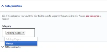
Categorizing your page will allow you filter specific types of pages if you choose to place a Page view on your site. In order to categorize pages, you must create taxonomy terms.
To categorize a page:
- Create a page or edit an existing one.
- Select the Categorization dropdown.
- Search the desired Taxonomy Term or select from options provided.
- Save.
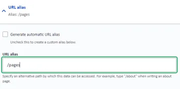
In general, the URL alias (the grey portion of the URL) for a page will be based on the name of the page. For example, a page called News, will have the alias "/news". If you would like the page to have a different alias, you are able to manually enter one on a new or existing page.
To edit a URL alias:
- Create a page or edit an existing one
- Select the URL Alias dropdown
- Uncheck Generate automatic URL alias.
- Type in the alias you would like your page to have
- Save
Useful Links
Page Elements
These are examples of the page elements you can use to build your page. More detail on each of these elements can be found by following the link provided in the respective dropdown.
This is an example text body. Plain text is displayed on a white background and can be edited with a Editor Toolbar.
Below is a sample accordion. Accordions can be used to consolidate space on a page by placing information in dropdowns. This is especially useful for making pages like FAQs more organized.
Below are two sample card rows, featuring some of the different color options for cards. The first row of cards displays bordered cards with images. The second card row displays borderless cards with links. Cards can be used to display small blocks of information, provide a preview of groups or organizations, or link to other pages.

Card 1
Lorem ipsum dolor sit amet, consectetur adipiscing elit, sed do eiusmod tempor incididunt ut labore et dolore magna aliqua.

Card 2
Lorem ipsum dolor sit amet, consectetur adipiscing elit, sed do eiusmod tempor incididunt ut labore et dolore magna aliqua.

Card 3
Lorem ipsum dolor sit amet, consectetur adipiscing elit, sed do eiusmod tempor incididunt ut labore et dolore magna aliqua.
Below is a sample contact item. Contact items are useful for displaying contact information uniformly.
Below are examples of the slider and grid photo gallery displays. You can use the slider display to create a carousel or the grid display to create a gallery view.

Sample Caption #1
Sample Image Credit A
Sample Caption #2


Below is a sample text with background item. Text with background items can be used to create full width background that extend across the page, or they can be used to create text bodies with colored backgrounds that only extend the width of the page content area.
Below is a sample text with media item. Text with media allows you to place text over an image or a remote video from Youtube or Vimeo. Like text with background items, text on media can also be configured to extend the full width of the page or just the width of the page content area.

Below is a sample person view. Views can be used to display content items like news, events, people, and pages. Views can also be filtered using taxonomy terms to only display certain items.


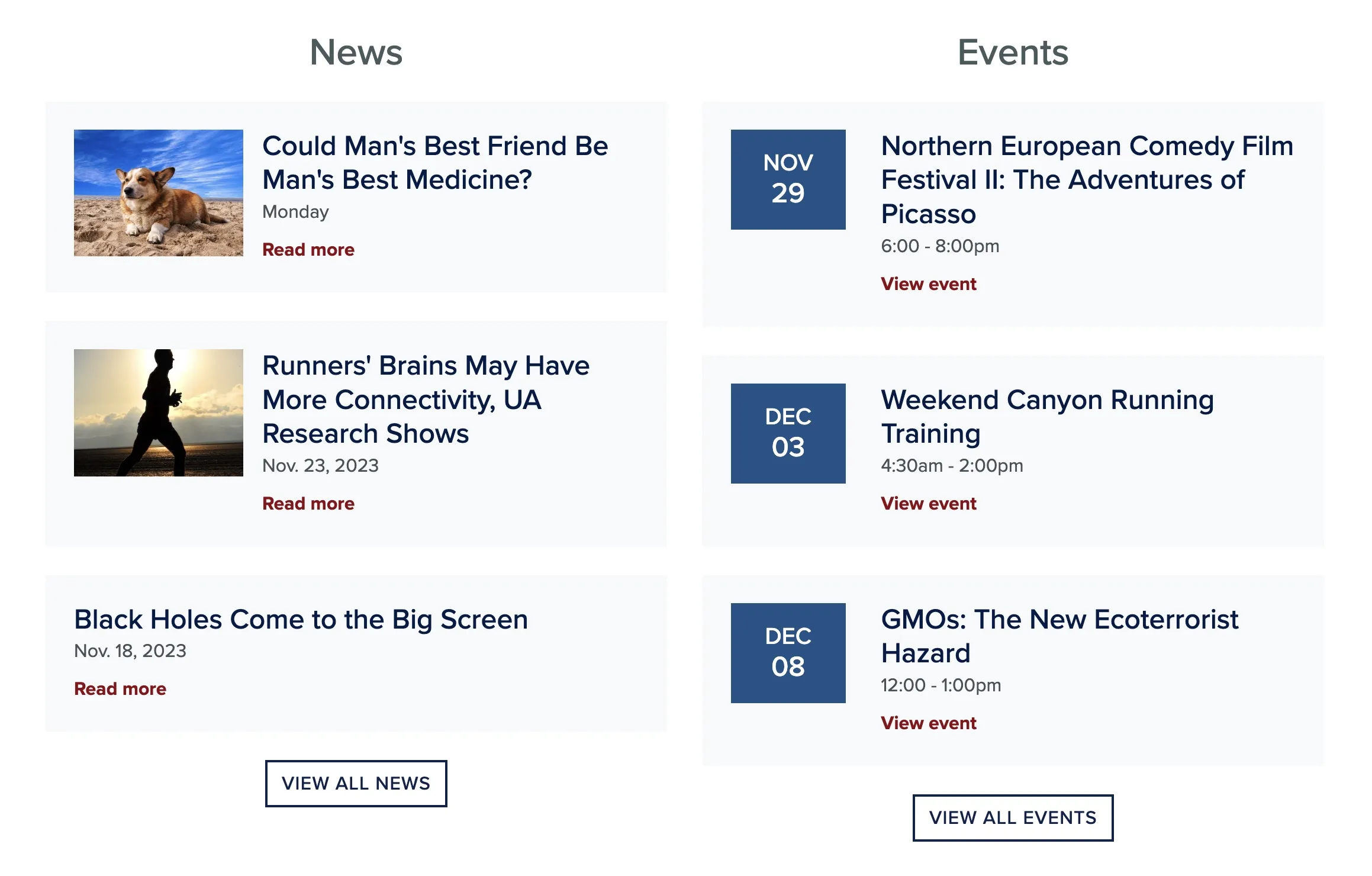
Below is a sample Views Side-by-Side page element displaying news and events. This page element can be used to display two different views side-by-side on desktop screens. For each view, you can include an optional custom title above the content and an optional custom button below the content. Like standard views, each view can be filtered using taxonomy terms.
Note: This page element is currently experimental and is not enabled by default in Quickstart.