
Once you have created webform elements, you can always go back and change them. There are many options for altering webform elements, but many basic edits can be made using the tools in the General tab.
There are two key ways to edit a webform: through the Structure tab or through the page the webform has been placed on.
Accessing Editing Through Structure
- Navigate to Manage > Structure > Webforms.
- Select Build next to the webform you would like to edit.
- Make desired changes
Accessing Editing Through Webform Page
- Navigate to the page the webform is placed on.
- Select Build.
- Make desired changes.
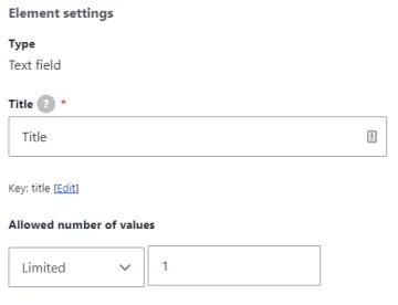
Within the Element Settings area, you can edit the element's type, title, and allowed number of values.
Editing Element Type
Element types can be changed in the editor window, but only into similar element types. A list of element types from which to choose will be provided- you will not be able to pick any format.
- Select Edit next to the desired element.
- Select Change under Type.
- Navigate to the desired element type.
- Select Change.
- Save.
Editing Element Title
- Select Edit next to the desired element.
- Change the title as desired.
- Save
Editing Allowed Number of Values
This area allows the editor to dictate the number of answers the responder can choose. The default value is limited to 1, but can be changed if desired for multiple choice element types.
- Select Edit next to the desired element.
- Choose whether the element should allow Limited or Unlimited answers.
- Enter the answer limit, if applicable.
- Save
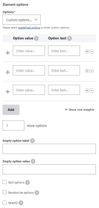
Element Options is an area that accompanies multiple choice elements that the responder selects their answer from, rather than inputting one themselves. These include elements like select and radios, which can be found under Options Elements in the Select an Element window. Advanced and composite elements like mapping, addresses, and contacts also have an options section with specialized fields appropriate to the element itself.
Within the Elements Options area, you can edit custom options or alter the predefine options type.
Editing Element Options
- Select Edit next to the desired element.
- Select the Options dropdown to change the predefined option type
- Predefined options include: Date and Time, Demographic, General, Geographic, Language, and Likert
- To add custom options, select Custom Options from the dropdown.
- Select Add or the (+) next to a custom option to add another option
- Fill out Option Value and Option Description/Text
- Select the Options display dropdown to change the number of columns options are distributed across
- [For relevant elements] Select the Options description display dropdown to alter whether the description appears below the option or as a help tooltip
- [For relevant elements] Enter Empty option text and Empty option value, if leaving any options open
- Save
This area allows the editor to provide explanatory or instructive text to accompany the element. The text can be formatted using the CK editor.
Element descriptions appear under the element in a smaller text. Help text is displayed in a tooltip next to the the element. More text is displayed in a dropdown under the description.
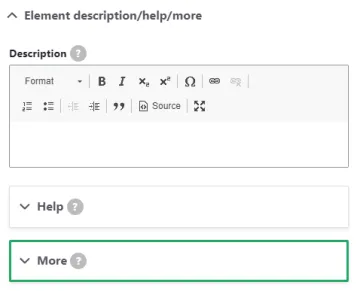
Editing Element Description, Help, and More text
- Select Edit next to the desired element.
- Expand the Element Description area.
- Enter desired description or make changes with the CK editor.
- If desired, enter or alter Help Title and Help Text.
- If desired, enter or alter More Title and More Text.
- Save
This area allows editors to make changes to the way the element will look. Each item has a Help tooltip to provide an explanation of how to use it.
Fields
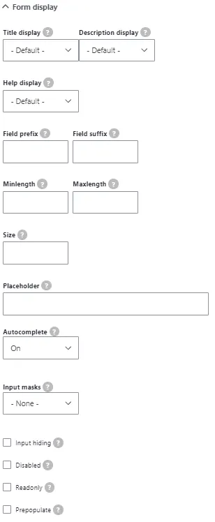
Note: Not all elements have all these fields.
Title display: Allows editor to change the position of the title - Before, After, Inline, Invisible, or None. The default display is Before.
Description display: Allows editor to change the position of the description - Before, After, Invisible, or Tooltip. The default display is After.
Help display: Allows editor to change the position of the help tooltip: Before title, After title, Before element, or After element. The default display is After title.
Field prefix: Allows editors to provide some text or symbols before the element. This is most common for text-entry elements.
Field suffix: Allows editors to provide some text or symbols after the element. This is most common for text-entry elements.
Minlength: Allows editors to set a character minimum for a text-entry element.
Maxlength: Allows editors to set a maximum of characters for a text-entry element.
Size: Alters size of text elements, if placed in a fieldset or flexbox
Placeholder: Allows editors to provide some filler text in a text-entry element.
Autocomplete: Allows editors to enable or disable autocomplete and autofill technology.
Input masks: Allows editors to impose a formatting style of the element input
Input hiding: Allows editors to hide text input (ex: passwords) as black dots
Disabled: Useful for displaying default values.
Readonly: Useful for displaying default values.
Prepopulate: Prefills element with alterable answer
This area allows editors to ensure responses conform to certain specifications.
Fields
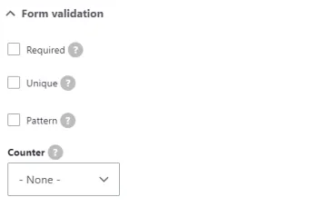
Required: Responder must enter a value into element
Unique: Ensures response must be unique, either per entity or per user. Includes a message area to provide clarification to responder.
Pattern: Ensures response conforms to a certain format. Includes a message area to provide clarification to responder.
Counter: Creates a minimum and maximum on characters or words in a text field. Includes a message area to provide clarification to responder.